Showing posts with label silk screen. Show all posts
Sunday, February 10, 2013
Storm Update and Double Bag Prototype
The Blizzard of 2013 was a whopper of a storm, dropping 27 inches of snow on our town in central Massachusetts. The wind created some strangely beautiful sculptures on our cars. My sedan is parked ahead of the Volvo, close to the garage, and that's a 3 foot drift on top of its roof. Quite a powerful wind!
We're all dug out now and the landscape is dominated by huge piles of snow everywhere. We are grateful to have kept electricity throughout the storm, unlike hundreds of thousands of people in the southeastern part of the state. I can handle shoveling snow and braving the cold, but I really dislike having no power. So, we were fortunate.
One drawback to renting a studio outside the home is not being able to go there in the midst of a storm. I filled Friday evening and all day yesterday with knitting, which helped pass the time but didn't truly satisfy. I longed to sew, and was happy to spend 7 hours in the studio today, working on another linen jacket. More about that in a future post.
There are still some items I made in November and December I haven't blogged about, so I thought I'd show you some bags I made back then.
You may recall the double bags I made last September using Marcy Tilton's Vogue 8590. I had good feedback from others concerning the concept of two bags that hook together for pairing up. But I had an idea to change the shape into a clutch, making them a perfect size for tucking into a large tote.
This also grew out of some really great wristlets I've carried for several years, made by Hobo International. The bags have wallet-like interiors - zippered and open pockets, and slots for credit cards. They're also large enough for a tissue, lipstick, and phone. There's a wrist strap for carrying, but I usually stash mine under my arm. These bags are the perfect solution for running errands, when I don't need to take my entire tote into a store. I just grab the wristlet and go.
Using Marcy's pattern as a starting point, I melded both ideas into one. I maintained the shape of Marcy's bag, but drafted it shorter in height and longer in length. I added a shoulder strap, but have to admit I don't usually keep it on as I prefer a clutch. I kept the exterior pockets, but added a wallet-like interior.
My basic everyday clutch is the gray and black one shown below. The lining is the same green silk faille used in my charcoal felted tote. The black spherical motifs are painted using Marcy Tilton's "African Suns" silk screen.
The second bag is in shades of blue, gray and black. It looks great paired with the everyday bag. I often carry them together when going out for dinner.
I love the cotton jacquard used on the face of this bag. The back and side tabs are a gorgeous deep blue crushed taffeta that carries the blue color further.
Pleased as I was with this duo, I decided to make a third bag that would coordinate with the basic bag. This time I went with shades of wine and gray.
This side is made with a chenille and metallic brocade. The reverse is silk dupioni painted with another Marcy Tilton silk screen.
All of the fabrics I used are from Sawyer Brook. Several of them are remnants that I truly wish I had more of, as they work so well together.
These bags are really fun to carry. The interiors are all the same, so I can use any of them as a wallet/clutch. When paired together, I can switch which sides are on the outside, so there's a variety of looks that can be achieved.
I'm planning to make several sets of these to sell. I've got a couple of kinks to work out first, though. I'm having trouble finding the metal slide that's used to adjust the strap length, in the black nickel color. I can find gold and silver, but I really like the darker color with certain fabrics. I'm also toying with changing the location of the rings the strap clips on to, from the sides of the bag to the top. I'd really like them to tuck into the top of the bag and slip out when needed. Perhaps most wearers would use the strap all of the time, so maybe that's not so much of an issue. I just think it looks a little strange to have loops and rings on the sides of a clutch. Any ideas?
Friday, February 1, 2013
Vogue 1262: A Jacket Begun
I don't know what sensibility overtook me, but last weekend I decided to make a spring jacket. It must have been the drab winter that drew me to think about sewing for spring. Perhaps it was these noticeably longer days that bring promise of fairer weather (eventually). My normal sewing mode is making things I can wear right away, so it's been an odd feeling working on something I'll need to wait a few months to use. But it's also been fun to sew linen in winter, to be working with colorful fabric when all is gray outside.
A review of the fabrics in my collection is also partially responsible for the genesis of this jacket. I have several solid linens perfect for jackets. I chose a deep blue-teal one, and proceeded to pattern selection.
I've been wanting to make Sandra Betzina's Vogue 1262 for some time. I like the lines of the jacket, and the fact that I would need to do little pattern adjusting because her patterns go up to my general size.
Last weekend I traced off the pattern and did a fit using that interfacing pattern paper stuff - Swedish pattern paper, I think it's called? Anyway, the fit looked to be good and I liked the style on my body. I pressed and laid out the teal linen, only to discover it is too narrow for cutting this pattern. You see, the sleeve and back are one pattern piece, so the fabric needs to be wide. I considered adding a center back seam, but even then, the 54" wide teal linen was too narrow.
Sooo, back to the stash, where I realized all of my linens are in the 54" to 56" width range, and none of the pieces were long enough to cut out this fabric hog of a pattern. But then I came upon a pool blue mid-weight piece from Sawyer Brook (actually, three pieces) that had plenty of yardage for this project. By opting for a center back seam, I was able to fit the pattern on the fabric. That's how I went from deep teal to the pool blue you see here.
This is thedouble quadruple pocket welt, all ready for insertion. The pocket was a fun construction, and would be easy to adapt to other patterns.
Four rectangles are folded in half, the base ones are basted together, and the top ones laid 1/2" from the center fold. I didn't have a contrast fabric for the upper welts, so I painted them with silver Lumiere paint, using a silk screen from Marcy Tilton. You'll notice the silver is more pronounced toward the center of the piece. That's because the paint didn't go through the screen well, and I hand painted the stripes in with a small brush. (See, I do make mistakes!) Only 1/2" of the welt shows in the finished pocket, so I only needed to paint the center.
The next step is to make a window in the front of the jacket. It is shown here, with Steam-a-Seam II finger-pressed on it.
Working from the right side of the jacket front, I laid the welts under the window and steam pressed them, fusing them to the window edge. Careful edgestitching followed.
There is just one drawback with this pocket: it's a fabric waster. I think Sandra drafted it to make it easy to insert, but as you can see, the welt didn't need to be so wide. The pocket top and bottom are sewn to the top and bottom edges of the welt, but after sewing the sides of the pocket together, 1-1/2" is cut off the top of the pocket. Plus, all four welt pieces were interfaced (non fusible), so there are 8 layers of fabric in the welt area. I trimmed out the excess interfacing and graded the center two pieces of welting to lessen the thickness. I'm knit picking here, but I'd rather not throw out pieces of interfacing that could have been used elsewhere.
I really like the look of this pocket. The painting adds just a touch of interest, but isn't overpowering. I'm careful to not wear horizontal lines across the largest part of my body, but I think these pockets are quiet enough that they won't draw too much attention.
I started the pockets this afternoon, and have only to make a Hong Kong finish around the raw edges. (The jacket is unlined.)
I'll be working on the jacket all weekend, so I hope to have it near completion by game time Sunday night. Yes, I'll be watching. No, I'm not a sore loser. I'm not sore at all that our beloved Tom Brady et. al. will be sitting the game out. Truthfully, the Patriots got what they deserved in that last game. They fell apart. Good luck to both teams in the Harbaugh Bowl!
A review of the fabrics in my collection is also partially responsible for the genesis of this jacket. I have several solid linens perfect for jackets. I chose a deep blue-teal one, and proceeded to pattern selection.
I've been wanting to make Sandra Betzina's Vogue 1262 for some time. I like the lines of the jacket, and the fact that I would need to do little pattern adjusting because her patterns go up to my general size.
Last weekend I traced off the pattern and did a fit using that interfacing pattern paper stuff - Swedish pattern paper, I think it's called? Anyway, the fit looked to be good and I liked the style on my body. I pressed and laid out the teal linen, only to discover it is too narrow for cutting this pattern. You see, the sleeve and back are one pattern piece, so the fabric needs to be wide. I considered adding a center back seam, but even then, the 54" wide teal linen was too narrow.
Sooo, back to the stash, where I realized all of my linens are in the 54" to 56" width range, and none of the pieces were long enough to cut out this fabric hog of a pattern. But then I came upon a pool blue mid-weight piece from Sawyer Brook (actually, three pieces) that had plenty of yardage for this project. By opting for a center back seam, I was able to fit the pattern on the fabric. That's how I went from deep teal to the pool blue you see here.
This is the
Four rectangles are folded in half, the base ones are basted together, and the top ones laid 1/2" from the center fold. I didn't have a contrast fabric for the upper welts, so I painted them with silver Lumiere paint, using a silk screen from Marcy Tilton. You'll notice the silver is more pronounced toward the center of the piece. That's because the paint didn't go through the screen well, and I hand painted the stripes in with a small brush. (See, I do make mistakes!) Only 1/2" of the welt shows in the finished pocket, so I only needed to paint the center.
The next step is to make a window in the front of the jacket. It is shown here, with Steam-a-Seam II finger-pressed on it.
Working from the right side of the jacket front, I laid the welts under the window and steam pressed them, fusing them to the window edge. Careful edgestitching followed.
There is just one drawback with this pocket: it's a fabric waster. I think Sandra drafted it to make it easy to insert, but as you can see, the welt didn't need to be so wide. The pocket top and bottom are sewn to the top and bottom edges of the welt, but after sewing the sides of the pocket together, 1-1/2" is cut off the top of the pocket. Plus, all four welt pieces were interfaced (non fusible), so there are 8 layers of fabric in the welt area. I trimmed out the excess interfacing and graded the center two pieces of welting to lessen the thickness. I'm knit picking here, but I'd rather not throw out pieces of interfacing that could have been used elsewhere.
I really like the look of this pocket. The painting adds just a touch of interest, but isn't overpowering. I'm careful to not wear horizontal lines across the largest part of my body, but I think these pockets are quiet enough that they won't draw too much attention.
I started the pockets this afternoon, and have only to make a Hong Kong finish around the raw edges. (The jacket is unlined.)
I'll be working on the jacket all weekend, so I hope to have it near completion by game time Sunday night. Yes, I'll be watching. No, I'm not a sore loser. I'm not sore at all that our beloved Tom Brady et. al. will be sitting the game out. Truthfully, the Patriots got what they deserved in that last game. They fell apart. Good luck to both teams in the Harbaugh Bowl!
Tuesday, August 21, 2012
The Bag to End All Bagmaking (So I Vowed)
Some time ago I promised to write about a handbag I made in July. I'm finally ready to do it. I'm not sure what it is about my procrastination in blogging. I do my best writing with a really clear head, which I don't always have. So I put it off. Going forward, I'm going to try to blog during the process of making things, so things are fresher and quicker in getting onto the page. But I'm usually sewing full-tilt when I'm making something, so my head won't be clear... I don't know what the answer is. Any recommendations or thoughts from you readers are welcome!
Anyway, here it is, The Bag to End All Bag Making:
I started out with the desire to make a sturdy canvas bag to schelp all of my stuff to work - normal handbag items plus lunch and a water bottle. The natural colored canvas I painted with a wash didn't thrill me, but the pieces of linen I had painted with silk screen images did. So I switched to black duck, and was going to make "windows" in it and stitch the linen pieces in behind. Ever try to make a clean, flat window in duck? Not a chance. That's when Marcy Tilton's Vogue 8173 popped out of my pattern cabinet.
(Yes, I own a retro Butterick cabinet, gifted from an acquaintance who purchased it from a store that went out of business decades ago. It holds my pattern stash and much, much more.) But I digress.
The pattern is out of print, and I purchased it years ago because it incorporated silk screening. In fact, it's one of the patterns that nudged me into learning to paint fabric. I had never made it, and I had all of these images painted onto colorful fabric, and I had some gray silk dupioni and gray silk organza, and steam a seam lite, and batting, and Craf-Tex, and hardware, so I dove into the project. And it consumed me. For days. Weeks. For, maybe, 60 to 80 hours. Waaaaay too much time. But it was only time, and I was having fun, so it was all good.
Why did it take so much time? Cutting was partly to blame. I was very careful to cut the dupioni on grain, so I didn't double layer it. The various interfacings were stiff and bulky, so I cut them in one layer. All together, from the outside to the lining, there are 9 layers.
Also, I cut out all of the images painted on the linen. Scissors worked best, but it took a lot of time. Sewing took a long time, too, but I'm getting ahead of myself.
The exterior of the bag is constructed in several layers. The first step is to paint the Steam a Seam Lite. In this photo, you'll notice dark coral rectangles toward the top of the bag. (Click on the photo for a larger image.)
I love how the many layers give so much depth. You can see the texture in the dupioni, the painting on the Steam a Seam, the linen pieces, the organza, and finally the stitching. The light batting gives the linen fragments some dimension.
I didn't have enough aqua/turquoise linen for the lining, so I used a stretch cotton satin from Sawyer Brook. I applied a non-stretch fusible interfacing to keep it from stretching, which worked very well.
Marcy included a zippered pocket in the pattern. I made it slightly deeper, and changed the technique a bit. She used the top zipper tape as the top edge of the pocket. I chose to cut a strip of fabric for the top instead. I love the contrast of the zipper with the gray dupioni.
I wanted more pockets, so I created a double pocket that is tucked to make pouch shapes. I couldn't resist using a painted linen remnant for the lining.
I love trimming interior pockets with ribbon. It adds a little detail that makes me smile when I see it.
These pockets are perfect for my glasses case and phone. I added a magnetic snap at the center above the pockets, to hold the bag closed.
I thought the shirred handles shown in the pattern photo looked dated, so I made stiff ones. I cut them a few inches shorter, as I don't carry bags on my shoulders. The handles are made with the technique I described in my previous post. I love how rigid the Craf-Tex makes them. They don't crumble in my hand!
Before assembling the outer bag, I cut pieces of heavy Craf-Tex the size of the sides of the bag. The corner edges of the bag are edgestitched, which holds the Craf-Tex in place. Craf-Tex is a very stiff product that gives the bag the rigidness and stability I like. I didn't use it on the ends, because I wanted them to fold in.
Applying the binding was the point at which this became The Bag to End All Bag Making. I vowed to never make another handbag again, ever. I recall begging the Universe to save me from myself. Sewing through all of the layers and getting the binding even were very demanding tasks, and tried my patience. it was quite crazy making!
In hindsight, I should have used the lite Craf-Tex, as the heavy was very difficult to stitch through, especially with 8 other layers involved. It was a real struggle for my machine, and I had to hand stitch the ring tabs in place on the inside, as my Pfaff just couldn't handle it.
Surprise, surprise - the Universe did not save me from myself. (Does it ever?) Two weeks later, I made another bag. With Craf-Tex only in the handles. And lots of paint, lots of color, and lots of play. It was a blast. So was this one, actually. I really enjoyed the process, enjoyed seeing what the bag became as I worked on it. And now I enjoy carrying it. It's not a canvas tote, but my handbag necessities fit inside, and I can even squeeze a sandwich into it!
Anyway, here it is, The Bag to End All Bag Making:
I started out with the desire to make a sturdy canvas bag to schelp all of my stuff to work - normal handbag items plus lunch and a water bottle. The natural colored canvas I painted with a wash didn't thrill me, but the pieces of linen I had painted with silk screen images did. So I switched to black duck, and was going to make "windows" in it and stitch the linen pieces in behind. Ever try to make a clean, flat window in duck? Not a chance. That's when Marcy Tilton's Vogue 8173 popped out of my pattern cabinet.
(Yes, I own a retro Butterick cabinet, gifted from an acquaintance who purchased it from a store that went out of business decades ago. It holds my pattern stash and much, much more.) But I digress.
The pattern is out of print, and I purchased it years ago because it incorporated silk screening. In fact, it's one of the patterns that nudged me into learning to paint fabric. I had never made it, and I had all of these images painted onto colorful fabric, and I had some gray silk dupioni and gray silk organza, and steam a seam lite, and batting, and Craf-Tex, and hardware, so I dove into the project. And it consumed me. For days. Weeks. For, maybe, 60 to 80 hours. Waaaaay too much time. But it was only time, and I was having fun, so it was all good.
Why did it take so much time? Cutting was partly to blame. I was very careful to cut the dupioni on grain, so I didn't double layer it. The various interfacings were stiff and bulky, so I cut them in one layer. All together, from the outside to the lining, there are 9 layers.
![]() |
| Interfacings, Steam a Seam, batting, and stiff paperboard to stabilize the bottom. |
![]() |
| Materials for the exterior, and templates for cutting the images into shapes. |
These, along with dark gray squares across the center and dark teal rectangles along the bottom, were painted on the Steam a Seam. After they dried, I fused them to the two outer pieces of the bag. Peeling away the paper, I had a nice, tacky surface to lay the linen pieces and ribbon on. Then I fused the silk organza on top. The Steam a Seam melted into the dupioni, but also held the organza in place.
Quilting was the next step, and it took a long time. Probably 4 to 5 hours for each side. I used two colorways of variegated thread, outlining each piece and tying the ends on the back side of the fabric. This added a big Wow factor, bringing the linen pieces into focus behind the organza.
I love how the many layers give so much depth. You can see the texture in the dupioni, the painting on the Steam a Seam, the linen pieces, the organza, and finally the stitching. The light batting gives the linen fragments some dimension.
I didn't have enough aqua/turquoise linen for the lining, so I used a stretch cotton satin from Sawyer Brook. I applied a non-stretch fusible interfacing to keep it from stretching, which worked very well.
Marcy included a zippered pocket in the pattern. I made it slightly deeper, and changed the technique a bit. She used the top zipper tape as the top edge of the pocket. I chose to cut a strip of fabric for the top instead. I love the contrast of the zipper with the gray dupioni.
I wanted more pockets, so I created a double pocket that is tucked to make pouch shapes. I couldn't resist using a painted linen remnant for the lining.
I love trimming interior pockets with ribbon. It adds a little detail that makes me smile when I see it.
These pockets are perfect for my glasses case and phone. I added a magnetic snap at the center above the pockets, to hold the bag closed.
I thought the shirred handles shown in the pattern photo looked dated, so I made stiff ones. I cut them a few inches shorter, as I don't carry bags on my shoulders. The handles are made with the technique I described in my previous post. I love how rigid the Craf-Tex makes them. They don't crumble in my hand!
Before assembling the outer bag, I cut pieces of heavy Craf-Tex the size of the sides of the bag. The corner edges of the bag are edgestitched, which holds the Craf-Tex in place. Craf-Tex is a very stiff product that gives the bag the rigidness and stability I like. I didn't use it on the ends, because I wanted them to fold in.
Applying the binding was the point at which this became The Bag to End All Bag Making. I vowed to never make another handbag again, ever. I recall begging the Universe to save me from myself. Sewing through all of the layers and getting the binding even were very demanding tasks, and tried my patience. it was quite crazy making!
In hindsight, I should have used the lite Craf-Tex, as the heavy was very difficult to stitch through, especially with 8 other layers involved. It was a real struggle for my machine, and I had to hand stitch the ring tabs in place on the inside, as my Pfaff just couldn't handle it.
Surprise, surprise - the Universe did not save me from myself. (Does it ever?) Two weeks later, I made another bag. With Craf-Tex only in the handles. And lots of paint, lots of color, and lots of play. It was a blast. So was this one, actually. I really enjoyed the process, enjoyed seeing what the bag became as I worked on it. And now I enjoy carrying it. It's not a canvas tote, but my handbag necessities fit inside, and I can even squeeze a sandwich into it!
Wednesday, August 15, 2012
French Holiday Bag
I promised to write about the bag I made in July, but first I want to tell you about the bag I made in the past week. As soon as I finished The Bag To End All Bagmaking, sneak peeked in my previous post, I learned about a handbag contest on Pattern Review. The bag had to be made between August 1 and 15. At first I didn't think I had the reserves to make another bag right away, but with the encouragement of others and two weeks of trying to figure out what to make, I started on this:
I've had Marcy Tilton's Vogue 8590 in my pattern stash for several years. It was actually the impetus that led me to collecting silk screens and learning how to use them. I've been gathering silk dupioni pieces as I see them when fabric shopping. When I realized this gorgeous rayon batik from Sawyer Brook coordinated nicely with several of the silks, I chose it as a lining fabric and dove into the project.
First up was to cut my fabric pieces down to size to prepare for painting them. I prefer to paint before cutting pattern pieces out, as it's easier to handle larger pieces of fabric. My bag is made from 8 fabrics (the pattern calls for 9, including lining). Marcy made the cutting process much easier by grouping pattern pieces according to which fabric they're to be cut from. Here is a sample panel:
The pieces are drafted on the same grain line, so you can simply lay the panel over the fabric and cut the pieces out. This is what I did, with the exception of two fabrics that were small and required the pieces to be placed closer together in different arrangements. To make placing the painted images easier, I drew an outline of each piece on the dupioni using a disappearing chalk. Here is one of the painted panels, before the pieces were cut out:
When selecting which silk screen images to use, I considered the lining fabric. It spoke to me of fields of sunflowers and blazing bonfires at sunset. The sunflowers led me to Provence, and the French Holiday Bag was given its name. I used images culled from French culture - a fleur-de-lis, the Eiffel Tower, a letter written in French, a labyrinth from Chartres - as well as natural elements such as a singing bird, a nautilus shell, honeycomb, a bee, and a hydrangea.
Painting these pieces was lots of fun. It was challenging to keep in my head which colors of fabric would be adjacent to one another in the finished bag, so I could choose paint colors accordingly. I used 7 colors of Lumiere that echo the colors in the fabrics.
Construction of the bag went smoothly, with one exception. The interfacing was a Goldilocks affair. The first was too stiff, the second was too limp, but the third was just right.
I started by fusing Acro, a very stiff tailoring interfacing, to all of the outer pieces. After sewing the sides of the bag together, I realized there was no way it was going to gather well when the elastic was inserted into the front and back. it was just. too. darn. stiff. Out came the seam ripper and the seams, and I peeled off all of the interfacing.
My next choice was Armo Weft, a weft-insertion interfacing that gives soft stability. After fusing it, I knew this would gather nicely, so I moved forward and sewed the outer shell of the bag. And it had very little body.
Sooooo, I added a layer of Form-Flex, a woven fusible that had just the right amount of oomph.
The left side with Form-Flex. Nice and stiff, as opposed to the opposite side! It fused nicely over the sides of the bag, even though the seams had been sewn. After fusing, I stitched the Form-Flex to the seam allowances, to keep it in place. Not the proper method of applying interfacing, but no way was I ripping the seams out again.
It stands up! Much better.
The bag has four pockets - one on each outside end, a zippered one inside, and an open double pocket inside. I used the zippered one as drafted, but cut the other one longer, and made two small tucks at the bottom edge.
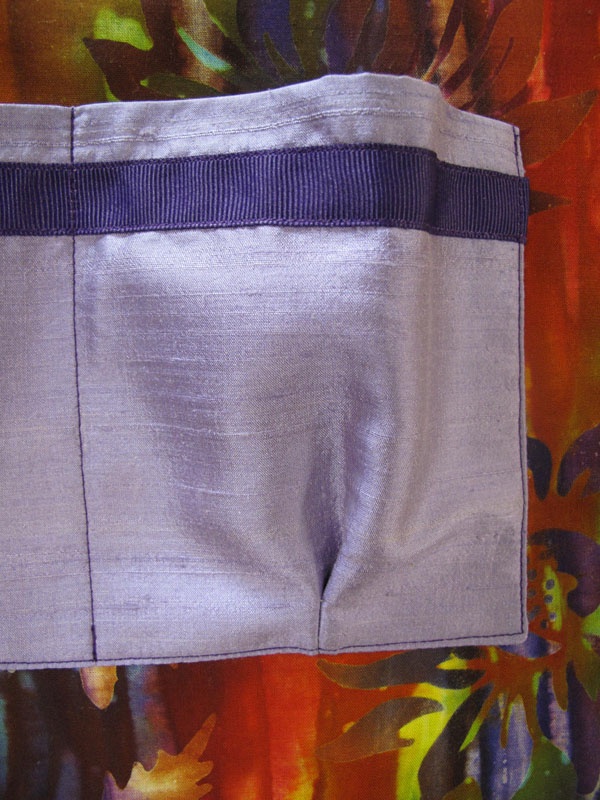
This forms a pouch, which makes it easier to slip in a glasses case or cell phone. I like to add small details to my bags, so I stitched on some grosgrain ribbon.
The grosgrain is also on the inside of the outer pockets, where it will never be seen (but it will make me smile when I remember it!)
The zippered pocket uses a welt method for inserting the zipper. It makes a nice, clean finish. I love all this color!
I wanted stiff, uncrushable handles, so I made some changes there. For each handle I cut two pieces of fabric and a 1" strip of Craf-Tex Lite, a stiff interfacing product Marcy stocks. It's fusible, so I simply wrapped one piece of fabric around it and fused.
I pressed the edges of the other strip of fabric an eighth of an inch narrower, sprayed it with adhesive, and finger pressed it to the other strip. I then edge stitched the handle with the narrower fabric facing up.
This process encases all of the raw edges without having to turn a tube of fabric, and the Craf-Tex makes it very durable.
To stabilize the bottom, Marcy recommends plastic canvas or cardboard. I prefer a really stiff bottom in my bags, and years ago I purchased a large piece of paperboard. It works great for this purpose. I add a layer of needlepunch so there's no "CLUNK" when I drop things into my bag.
I added feet to the bottom of the bag, which is why you see a hole drilled in the paperboard.
I ran into some difficulty when trying to pull the elastic through the casings on the front and back. My bodkin slipped off the elastic several times. I finally got it through. Instead of stitching in the ditch with the machine, I did it by hand. There's a ditch on the facing side, too, so the stitching needed to hide in both ditches.
Marcy used narrow ties to close the bag, which gave a nice finishing touch. I knew I wouldn't want to have to tie it shut, so I inserted a small magnetic snap in the center front and back facings.
The snap makes the bag a bit plainer, but with all of the images, color, and that fabulous lining, I think it looks just great! It won't be an everyday bag, but I can hardly wait to carry it to a museum, out to dinner, or on a shopping trip. Who knows? Maybe some day I'll get to carry it in Provence!
Labels:
batik,
dupioni,
French,
French Holiday,
handbag,
Marcy Tilton,
Provence,
silk,
silk screen,
Vogue 8590
Monday, July 2, 2012
Deep Pink String Art Top
Fifth and final in my month-long Butterick 5215 series, this top may be my favorite. I love, love, love the color of the cotton/lycra jersey (from Homespun Boutique in Ithaca, NY). I always get compliments when wearing this color, as it flatters my skin tone. I also like the contrast added by the black, pewter and white paint, and how the black mesh trim frames it all.
I began with the same pattern pieces as I used in the fourth top. This time I overlapped the vertical seams in front and back, and inserted the mesh between them. I added two rows of black topstitching for an added punch. I finished the sleeves and lower hem the same way. Here is detail on the back:
Each of these elements contributes to the drama of the completed top, but the paint is the key. Since several readers have mentioned wanting to learn to use silk screens, I've photo documented the process so I can walk you through it.
I must stress, I'm no expert at this. I strongly recommend finding a good teacher. That can be done in person or virtually. I learned to do it by watching Marcy Tilton's CD, On the Surface, an excellent tool filled with all sorts of techniques for surface design. The CD gave me a good grounding in how to go about painting with silk screens, and experience has taught me even more. I still learn every time I paint with my screens. I'm going to show you how I do it, but please don't think this is the only way, or the best way. It's just my way, and it keeps evolving.
The first step is to set up a work area. You'll need a counter-height surface in an area where the floor can be covered or easily cleaned. Drips and spills can happen. I imagine a table would work, but sitting doesn't give the range of motion I prefer. You'll also need enough room for two kitty litter pans with some water in them, and some space to dry the screens after painting and washing them.
After years of wanting to silk screen but not having the proper space, I'm blessed to have a very large cutting table that's just the right height for my tallness, built by my husband. It's the perfect place for me to paint fabric. To protect my cutting mat, I purchased a roll of plastic table covering. The painting process goes best with a bit of padding on your work surface. I had some yardage of needlepunch (from back in the olden days when I made shoulder pads. Yeesh, to think of the time I spent on that!) I lay the needlepunch over my cutting mat, then unroll the plastic tablecloth over it. Blue painter's tape is used on the edges to hold everything in place.
Fabric can be painted in yardage, or after the pattern pieces are cut out. I prefer to do it after cutting, so I can better determine flattering image placement. After painting a damselfly nearly on my bust point on one of my early painted tops, I've learned to hold the piece against my body to see where I might want to place images, and where I might not want to. When painting a piece, I tape it down here and there on the edges to hold it in place.
To paint all of the black horizontal lines down the edges, I knew I would need to paint the screen several times. I used a ruler to measure the length of the image on the screen, then placed the screen so the next image would begin in the correct place.
I could have just painted starting at one end of the seam line, but the paint needs to dry before placing the screen adjacent to it, or else the frame will overlap and smear the paint. Since I had 4 repeats of the screen, it would take a long time to complete the painting, as I'd have to wait for one to dry before doing the next. So, I marked with tailor's chalk where the images would end/begin, and painted one at the end of the seam, and one two spaces away. These shots don't really explain the process, so I hope my words do.
For this top, I chose Neopaque paint in black, and Lumiere in pewter and white. I've always used a sponge brush to apply the paint. Another method is to store the paint in a squeeze bottle, squeeze a line onto the screen, and pull it across the image. Since making this top, I've tried the credit card method and I must say I actually prefer it. I think less paint is wasted using the card.
Once the screen is placed where I want to paint, I load up my foam brush, and stroke it across the image. The screen needs to be held in place with the free hand while the painting hand brushes across the image until it is completely covered. Then the screen is carefully peeled away from the fabric. My brush strokes can be seen here, and you can see the fabric through the screen as I'm lifting the screen away. (The lower part of the screen has no paint because I didn't use the entire width of the image.)
Voila! Here is the painted image.
As is clear to see, I didn't force enough paint through the screen in a few places. This is easy to do, and I sometimes claim artistic license and leave it. This time I chose to use a very small paintbrush to touch it up. Here's a shot of the same image, touched up.
I did this along the length of the front and back seams, as sometimes the inner ends of the lines didn't match up well. The texture of the paint when dry can be a bit different when brushing it on like this, but in a bold paint job like this one, I wanted the graphic to be even and strong.
After using the screen ("striking") two or three times, it goes into the water bath. The paint can dry in the holes of the screen, so it's important to keep it very wet. That means working quickly. The metallic paints are worse for clogging screens, because the tiny metal bits dry rapidly. I use a sea sponge to softly wash the paint from the screen. Not all of the paint will come off, as the edges dry quickly. That's why you see darkness in the photos of the screen before I painted it. It's residue from past uses. It's dried on the surface of the screen, but not where the holes are.
Once clean, the screen goes for a dip in the rinse pan, and onto a wire dish rack to dry. If I'm in a hurry to use it again, as I was in this case, I lean it somewhere in the studio where there's good air flow. The wall directly across from my air conditioner has been my preferred drying area this summer.
Once I completed the black Riffle pattern, I started using the Circle Game screen (both from Marcy Tilton). I played with placement until I saw what I liked. I tried to paint two or three spheres with every strike, so I wouldn't have to make a separate strike for every sphere.
One effect I like is to blend two or more colors in one image. I used white and pewter on the large image above. This is done by simply swiping the colors where I want them. Sometimes the paint doesn't pass through the screen well where the colors meet, because I'm not applying even pressure there. Once again, a fine paintbrush completes the missing lines.
Toward the end of the painting process I got tired and made a big goof. Somehow I pushed a big blob of paint through the screen, resulting in this:
Actually, the blob was the wide line to the right of center. Not wanting to re-cut another front piece, I chose to turn the blob into a design element by painting a zig-zag across the entire image. This made the error appear more intentional, but I was still disappointed. After sitting on it (not literally!) overnight, I decided it didn't need to be "perfect" and went ahead with the construction of the top. The vertical and shoulder seams were sewn, and the mesh was inserted around the neck. I trimmed the last bit of the binding, and a moment later noticed I had cut about 2" into another part of the binding. That made two reasons to re-cut the left front piece. The third reason was the neckline was a little too wide at the left scoop, and wouldn't lie flat. I had the extra fabric, so I decided to redo it all. Hey - it's only time.
Taking out the double stitching was lots of fun, uh huh. So was cutting the left front again, this time folding out nearly an inch of the pattern at the front neck edge. Painting it was truly fun, as it was another day and I wasn't tired of painting. I placed the images a bit differently. Most notable is my choice of smaller images for the hemline. I decided placing a large sphere where it would fall in front of my crotch was not such a good idea! Here are the second and first pieces. The second is definitely an improvement.
I intentionally placed the spheres toward the center and neckline of the garment, to create a vertical element and frame my face. I always like to add a small touch of paint to a sleeve. It adds just a little touch of whimsy. I'm really pleased with the overall effect of the painting. The lines and spheres look as though they could be made of string!
A funky black mesh (from Marcy Tilton) was the icing on the cake for this top. It's a cool stripe of solid and sheer lines. The sheer parts have smidgens of fiber in them, like a burn-out. I cut the width of two stripes, but allowed only the sheer part to show. I like how it curls here and there, and gives strong definition to the neckline and overlapped seams.
Smooth, lightweight cotton jersey in a delicious color, bold graphic painting and asymmetry make this a top that I'll wear again and again. It was a very fun project, including the documentation of the painting process. I hope the information is helpful to anyone interested in learning to use silk screens. Please ask questions if you have them!
P.S. You may recall I was making these tops for a contest on Pattern Review. As the month progressed, I lost interest in the contest, and never entered it. But there's no loss, as I have five new tees to carry me through summer!
Subscribe to:
Posts (Atom)