Thursday, June 28, 2012

Reading Beside the Lines (and In the Mirror)


Continuing my play with B5215 for Pattern Review's One Pattern, Many Looks contest, I created this simple collage top. You may recognize the fabrics, as I used them in my Back Words Top. The stripe is bamboo/lycra, and the print is a yummy viscose/lycra from France. Both fabrics are from Sawyer Brook. The print has text printed backwards. I've read it in the mirror and can tell you it doesn't say much of anything coherent! 


I love this fabric combination, so I decided to make a short sleeve version for summer.

Splitting the pattern front and back into two pieces each was quite easy. Knowing I wanted asymmetry, I drew a line from the right shoulder at the neckline, to the hem. The front one is angled a bit toward the center at the neckline, then falls straight to the hem. The front neckline on the print side was drafted lower than the original pattern. I like the asymmetry of it. The seam I added to the back curves slightly at the shoulder, and also falls straight to the hem. 
After determining the placement of these seams, I traced my pattern pieces and added seam allowances. I considered overlapping the edges and inserting mesh in between the layers, but it seemed too busy. I opted for the simpler, cleaner look of a plain seam.

The neckband is a large mesh (from Marcy Tilton) cut on the bias, pressed in half, and stitched to the neck edge. I flatlocked the edge with my serger and topstitched 1/8" from the seam through all layers. This helps keep the band from curling outward, and I like the detail the fine line of black stitching adds.


I added another design element by hemming the striped side 1" shorter than the print. This adds a slightly quirky touch to the tee. I cover stitched the bottom and sleeve hems with my serger.
Although the colors don't exactly say "summer", the fabrics in this top coordinate perfectly with my black capris, so I know I'll enjoy wearing it. This was fun to design and sew up. If you've ever considered splitting the front and back of a tee into two pieces, I encourage you to try it. It's not difficult, and it creates a whole different look from a basic pattern.

Monday, June 18, 2012

Japanese Garden Tee


I've long wanted to paint a tee in a one-color tattoo effect with silk screens. This cotton/lycra jersey from Marcy Tilton nicely presented the opportunity. As I pondered colors, I realized silver paint would pair nicely with the soft coloring of the fabric.

I began by cutting out my TNT pattern for tops, Butterick 5215. (Yes, this is my second version for the PR contest.) I used the neckline as drafted on the original pattern, but after draping it on my front, I decided to lower it an inch. I should have added an inch to the side  and sleeve seams, as the fabric has just a little stretch, but I didn't think of it at the time. Fortunately, the negative ease through the bust line looks okay. But the sleeves tend to bunch up under my arms, as they're a bit too tight. Time to get those dumb bells out!

To determine the selection and placement of the silk screen images, I laid each piece out and auditioned various groupings. Once I had established the layout, I took out my disappearing chalk and drew a diagonal line from the upper right to lower left. I also drew lines to indicate where the edges of the images should fall. The fine white lines can be seen along the sides of the center image in this photo:

This chalk erases with ironing and washing. It was a great help, as each of the screens has a wide frame, and it can be tough to figure out how to align the images. Here are the screens I used for the back:

Here is the finished back. I also painted a small element on each sleeve.

To add a slight variation in the patterning, I added foil to the dragonfly images. The foil comes on thin plastic sheets. It and the adhesive it requires are available from Marcy. I also have a package by Jones Tones, but I don't recall where I purchased it. Perhaps from Dharma Trading? I see they stock it.

The foil on the left is holographic silver, and the right is silver with swirls of almost iridescent color. Funny how you can see the reflection of the camera and my hands!

The foiling process is quite easy. First, the adhesive is applied to the fabric and allowed to dry. I painted it on through silk screens, but it could be painted by hand, with a rubber stamp, or whatever. It looks like this when dry:

Once dry, the foil is placed over the image, and a hot dry iron is touched to it. Using the side of the iron to burnish the foil works well. The heat makes the glue melt and stick to the foil. Once it cools - just a minute or two is usually ok - the foil sheet is peeled off. I started with the holographic foil.
I didn't heat this long enough, so the image wasn't completely covered with foil. I decided I wanted to try the other foil. If there is still glue exposed on an image, it can be re-foiled. This attempt was more successful:

The foil sheet is clear where the foil has come off. You can see that all of the foil didn't come off. That's because the holographic foil had stuck to parts of the image. I like layering different colors of foil in this manner. On this top, I liked the swirl foil better, as it added some subtle color to the design.

Simply beautiful! Here's what the foil sheet looked like when I was finished. 

The sheet can be used again and again. On future projects, if I want just parts of an image to be foiled with this color, I can place a partially used area over the glued image, burnish it with the iron, and repeat the process with a different color. Layering the colors like this makes the image more interesting, especially when solid color foils are all one has. I really lucked out with this swirled foil. I just love the effect on this tee!

Sewing the top was very straightforward. I chose pale gray thread for topstitching the neck band and the hems. I really like how the color ties in with the paint color.

I also double stitched the sleeve and bottom hems 1/8" apart. I find this easier to do than using a twin needle. I also like the closeness of the stitching lines.

This top is comfortable and fun to wear. Now I need to make up that charcoal cotton from Marcy into a pair of capris. They would look great with this top!

Tuesday, June 12, 2012

Summery Print Tees

I've taken up a challenge issued by Pattern Review to make several unique garments using just one view of a pattern (One Pattern, Many Looks contest). Neckline shapes can be changed, and darts can be rotated, but only basic drafting is allowed (no facings, no collars, etc.). Piecing and color blocking are allowed. At first that sounded quite restrictive, but after some thought I realized it would be a good way of flexing my creative muscle. I'm using my TNT pattern (B5215) as a starting point.

The first two tops are quite straightforward, letting the print fabrics they're made from do the talking. This first one was completed before the contest began, so it won't be included in my entry. Too bad, as I really like it.

I love this lively yet calming print in two shades of blue in a linear pattern on white cotton/lycra. The fabric (from Sawyer Brook this spring) has a really nice hand - slightly beefy, with a good amount of stretch. It's comfortable and fun to wear.

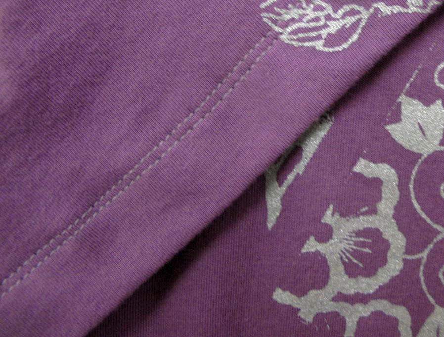
I changed the neckline to a vee with an overlapped band.

This is my way of getting out of mitering the band, and I like the look. The overlap is really easy to do. I start the band stitching a couple of inches up the left side of the front, around the back, and down the right front. When I get close to the end I stop and layer the two ends of the band over each other, pin them in place, and stitch around the corner. Topstitching the seam allowances helps the band lie flat. I finished this top by stitching the sleeve and bottom hems with two rows 1/8" apart, to echo the distance between the neck seam and neck topstitching.

This print looks great with navy and dark denim. I'm planning to make some navy capris or shorts to wear with the top. I have a good amount of fabric left over, and I think I can get a tank out of it. That will be a great layering piece come late summer.

Another angular print fabric currently available from Sawyer Brook is featured in my second top. This is an exquisite quality viscose/elastane made in France. The hand is dry and crepe-like, so pilling should be minimal. The fabric stretches in both directions, and is feels very light against my skin.

I love the craziness of this print - a rather chaotic design - and the rich colors. I thought I would enjoy wearing it, but I think there's a bit too much white for my coloring. I feel somewhat lost in it.

This points to a concept I learned while doing color work in knitting. I took a workshop with Brandon Mably - a wonderful teacher and person - who described white as "sucking the color out of everything". This print is a good demonstration of that concept. The colors are vibrant and rich, but the white seems to take their power away. Even though there is high contrast between the different colors, the amount of white really quiets the mix. In this case, it might be a good thing, considering how much the print has going on!

I wanted clean finishing on this top, so I hand stitched the inside of the band and the hems. I like the more refined look it gives.

I'm thrilled to finally have something to wear this pendant with. I purchased it over a year ago from a button vendor at the local sewing expo. It's dyed quartz with a jagged area that's drusy-like. The violet color is a perfect match with the fabric. It can use a slightly longer chain, but I'll enjoy wearing it with the tee.

On both of these tops, I used fine interfacing to stabilize the shoulder seams and hems. I ran out of Design Plus lightweight fusible bias tape, which I normally use, so I cut 3/8" wide bias strips of Sewer's Dream, and really liked how it worked.

Sewer's Dream is definitely my favorite interfacing for stabilizing jerseys. It gives just enough support to keep edges from stretching out of shape. It has stretch in one direction, and is stable in the other. The edges don't fray, as I've experienced with other fusibles for knits. Since I hand stitched the hems on this top, the interfacing wasn't a must, but I like the light support it gives. When machine stitching hems, I find it helps keep the edge from stretching.

Two more tops using this pattern are in the works - a solid I painted using silk screens, which is finished except for the hem, and a pieced version using fabrics you've seen here before. I hope to complete them tomorrow. I'm sure I'll come up with another version or two before the contest ends at the close of the month. This is a terrific way of keeping motivated to build my summer top wardrobe!

Friday, June 8, 2012

Royal (not a) Pain in the Neck Shirt

No, the shirt wasn't a pain in the neck to sew. But I don't absolutely love it, because I simply do not like to wear shirts. This particular one was yet another attempt to change my mind, but it didn't. I still don't like shirts, and if you stick with me, I'll explain why.

Last summer I purchased a washed tencel fabric in a gorgeous shade of royal blue from Homespun Boutique in Ithaca. Since then, I've been waiting for it to tell me what it wanted to be. I knew I wanted a top out of it, but I wasn't sure if it would be a shell or a shirt. Since a shirt requires buttons, I interviewed several blue shirt buttons from Sawyer Brook (oh, how I love having my studio right next door to SB. I had to walk all of 30 feet to get these buttons!). If I found a button that looked great, I would make a shirt.

Well, that square beauty on the right sure looked good! It's dyed corozo, aka "vegetable ivory", carved from the tagua nut. The color is a perfect match, and the square shape mimics the straight lines of the woven stripes in the fabric. This little button was my decision maker, and I moved forward with making a shirt. (If you're interested in the button, it is available in several colors here.)

I started with the same OOP Sandra Betzina Vogue pattern I used for my Nuevo Yukata shirt last summer. This time I left the neckline as drafted, rather than lowering the front a bit. I drafted a square-cornered mandarin collar and a long pocket. 

In the pattern instructions, Sandra gives permission to not put buttons at the top if there are no plans to wear it buttoned up. I don't like close-fitting fabric at my neck, and knew I'd never wear it buttoned, so I took advantage of her permission.

The shirt went together very easily. The fabric has good drape and the texture keeps it from being slippery. I made short sleeves and turned the sleeve hem allowance up twice and stitched, like the front bands are done. I did the same at the top of the pocket. I would have done the same at the hem, but didn't cut it long enough to do so. 


I really like how the buttons look on the fabric. I love how the grain of the natural nut shows in the finished button.

Button nirvana!

Ok, so why don't I like shirts? I think it has to do with the fabric. I love knits because they are soft and smooth and don't stand away from my body. This washed tencel has nice drape and breathes well, and I have to say it's a relatively comfortable shirt. But there's just too much fabric at the neck, at least for summer wear. I wore it yesterday and found it to be comfortable in 60 degree temperatures, but soon the weather will be too warm to wear it. I think I'll get more use out of it in fall and spring, when I can also wear it with a tank or cami underneath.
Not a pain in the neck, and such a gorgeous color!