Sunday, December 21, 2014

Butterick 5891 Revisited


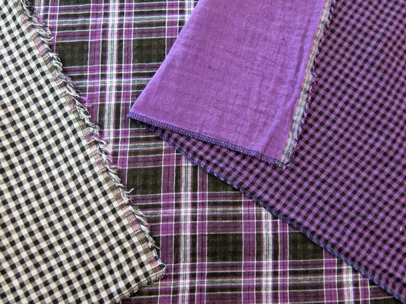
Earlier this year I purchased two doublecloth fabrics from Marcy Tilton. They are cotton gauze - lightweight, airy, with a soft drape. One is plaid with checks on the reverse side, the other is solid with checks on the reverse side. Purchased on separate occasions, I was pleased to find out the two fabrics played very well with each other. While not an exact match, the purples are very close, and I knew they would look great together in a garment.

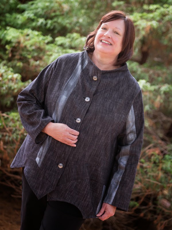
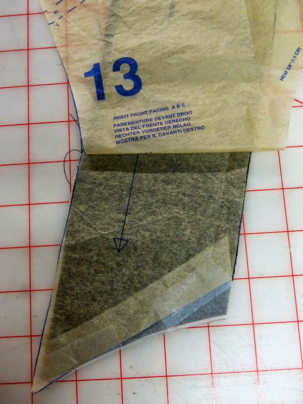
I allowed these fabrics to rest together on my design table for a couple of months, so I would see them often and think about what to make with them. It was a design challenge of sorts. I wanted to use all four sides of the fabric, but I didn't want the finished garment to look clownish or garish. After much consideration, I decided to go with my favorite pattern of the year, Butterick 5891.


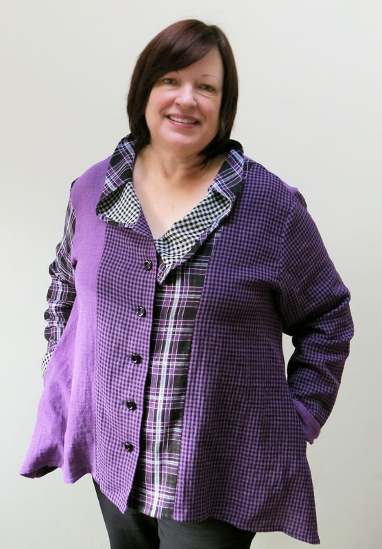
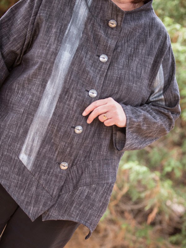
The plaid/check fabric was perfect for the collar, as both sides of the fabric show. I cut it on the bias for a bit more interest and better drape.


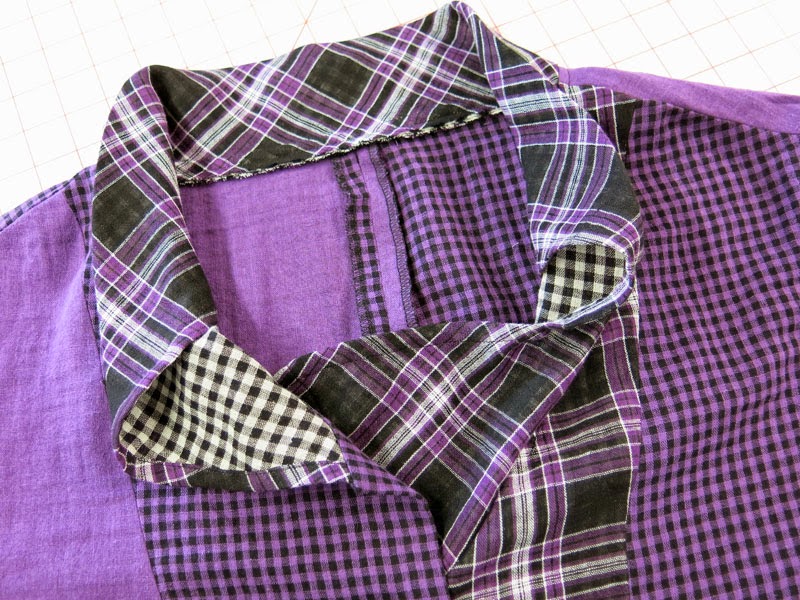
I love, love this collar! It's not difficult to make, and it gives a sweet focal point that frames the face.


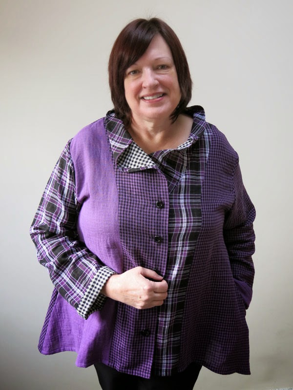
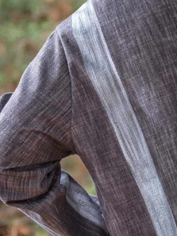
I neglected to take photos of the back, which is half purple, half purple check. Not wanting to feature the plaid, I kept its use to a minimum, trying to balance the overall look with it. There is no cuff on the pattern, but I narrow hemmed the edge to the right side, so I could turn it back to show off the white and black check. I like how that echoes what's going on in the collar.

Some rounded square buttons from Sawyer Brook tie into the square motif that runs throughout the top.


After taking photos of this garment on me, I saw how far off my shoulders the top hangs. I don't think that's the intended look, so if I make this again (for a fifth time) I will cut the shoulders and chest narrower and raise the top of the sleeve. 

I continue to be amazed at what I see in a photo that I don't see in front of a mirror! Things show up that I never noticed while making the garment. Has anyone else experienced this? Makes me think I should take photos while constructing and trying on a piece. Or just pretend I'm a camera when I look in the mirror!

Katherine Tilton hit one out of the ballpark with this pattern. Even with the loose fit, I love this top. The weather won't be conducive to wearing it until spring, but I know I'm going to enjoy it. It's super comfortable and easy to style. And it's purple!


Friday, December 12, 2014

A Disappointing Vest, Vogue 9034

And now I've come to the bottom of the pile, the last of the garments I made during the summer and early autumn of this year. The bottom of the pile also means the last of the photos taken by my sister, Lisa, at the end of October. I'll miss these colorful portraits!

In September, I whipped up this vest and top:


Only after arriving home and editing these photos did I notice I didn't have the lapels of this vest turned back properly. So, I took some selfies to show how the lapels are supposed to lie.


This vest was made using Vogue 9034, a pattern I can't recommend as is. The reasons? Many shortcuts were taken with the pattern instructions and pieces. And it's not a Very Easy Vogue pattern. So, what gives, Vogue?

First of all, the garment is lined to the edges. Not a good construction practice. I much prefer facings and hems, to give the garment more structure. Secondly, no interfacing in the lapels!!! Horrors! I foolishly followed the instructions, and put interfacing only in the collar. Big mistake, as you can see in the photos. Those lapels are crying out for more support.


Thirdly, no tailoring techniques were recommended. To give Vogue credit, the undercollar is cut in two pieces, on the bias. A surprise, considering the lack of any other tailoring tricks. I did know enough to hand sew the undercollar/body seam to the collar/facing seam. But I really should have interfaced the front, faced and interfaced the armholes, and hemmed the bottom. I'm not sure why I blindly sewed along to the directions. I must have been in a trance of some sort!

The fabric is a rayon/linen blend from Marcy Tilton. It was a gem to work with, and I love the color. The jersey for the top is from her, also. I used my TNT t-shirt pattern, Vogue 8793.


I love the print of the top, and it was cool how these two fabrics came together, as they were purchased separately. Too bad I probably won't wear the vest very much. It just looks too sloppy. A shame. I suppose I could take it apart and remake it the right way, but I'm not sure how motivated I am to do that.


I do like the asymmetry of the front of the vest. I'm not crazy about the rest of it, though, so I just might reclaim the fabric for another pursuit. I have at least 1/2 yard of the fabric remaining, so it could become part of another garment.

All in all, a disappointing pattern and garment.

*****
Why in the world, you ask, am I standing next to a Hindu statue (a deity?), with my hand on its head? Because I couldn't resist her. The grounds of the manor where my sister lives is dotted with these, along with a few Japanese and Celtic statues. An eclectic mix, almost humorously positioned among the grasses and Indiana limestone rocks that dot the landscape. I had fun wandering the gardens and photographing the statuary. Enjoy!


Friday, December 5, 2014

Denim Jacket Times Two


No, this isn't a photo of me, or my jacket. Wouldn't life be different if both were true?! This is Butterick 6106, a jacket I've made twice this year, with varying results. Here's the story:


Back in August I married this pattern to a mid-weight, denim-type fabric from Sawyer Brook (now sold out). I liked the striped version on the pattern envelope, as well as a plaid version Katherine Tilton posted on her blog. You know I like to add some paint to fabric whenever it's appropriate, so I jumped in and did it here. I laid the yardage out on my work table and masked off a 2 inch wide stripe about 6 inches from the selvedge. Then I took a brush and some pewter Lumiere paint and used light strokes to paint the stripe. I liked it so much, I repeated it at the other selvedge.

When I cut out the pattern pieces, I tried placing them where they would take advantage of the stripe. I didn't get fancy about matching stripes anywhere. I just wanted the stripes to appear in a balanced fashion. Not a perfect job, but I'm happy with it.


The fabric, which is all cotton, was a breeze to sew, and it stands up pretty well to the collar design. I was really pleased these buttons from Sawyer Brook matched the paint so well:


Sewing this design is like putting a puzzle together because of the asymmetry at the lower fronts. It's not difficult, but it requires patience and attention to detail. As I put the pieces together, I discovered two errors on the pattern. The first involves a mis-placed notch:


The notch at the top of piece #4 should have been about 1-1/2 inches to the right. I only figured this out when I went to attach it to the right front and found the notches were quite far away from one another.

The second error is on piece 13, the right front facing. The lower edge needs to be extended on one side and tapered to nothing on the other side, as shown below:


If you don't do this, you won't have enough fabric to cover a seam later on. So it's pretty important to fix it before you cut. You can see the problem if you lay piece 13 against the right front piece. It's just too short!

Aside from these two errors, the pattern sewed up really well, and was fun to construct. I really like this jacket and expect to get a lot of wear from it, since it's in a good-for-me basic color.


Oh, and one thing about the design of the lower left front. As you can see in the photo above, the lowest piece does "stand out" from the jacket. It's a bit odd, but I've grown to like it.

*****

Three months later, in late November, I decided to make the jacket again. 


And I'm not so happy about this one. First of all, the color is a stretch for me. Even though my eyes and hair are brown, it's hard to find brown that enhances my cool skin tone. I don't think this is bad, but it's not my best color. Agree?

The second problem is a larger one, and it involves an unhappy marriage of pattern and fabric. This is a lightweight denim of cotton, polyester and lycra. It is soft and drapey. Not the right fabric for this collar style. The collar can barely stand up, even with a facing and interfacing. And see the drag lines on the upper chest? Too soft a fabric.


And lastly, the fit of this jacket isn't good at all. I don't know why I didn't notice it back in August when I made the first one. The shoulders are just too wide on me. I should have cut this version in a smaller size. The style is loose, to a certain degree, but I don't think the sleeves should hang off the shoulder by more than an inch. I simply wasn't paying attention.

Oh well, on to the parts of this jacket I really like: the printing. 


Diane Ericson's  Bamboo Forest and Brush Alphabet stencils were a perfect pairing for embellishing this fabric. I used black Neopaque and copper Lumiere paints, which enhance those colors in the fabric (and the buttons, which are from Sawyer Brook). 


What a lot of fun this printing was! In fact, I love the printing so much, I'm not all that unhappy with the jacket. I just don't know how much I'll wear it because of the color, the baggy shoulders, and the drag lines. Honest opinions - would you wear this jacket if it looked like this on you? If not, what would you do with it? I welcome any and all comments!